Courtney:
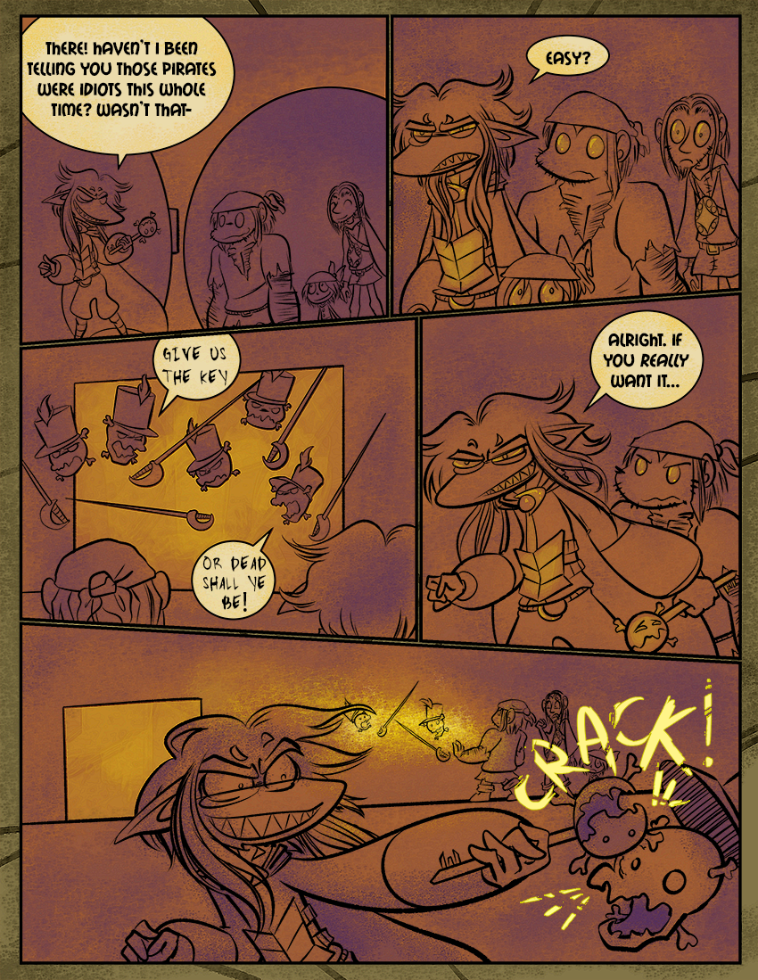
These guards were Victor’s idea, but they really remind me of the mask guys in Super Mario Bros 2 that come after you as long as you’re holding a key. They scared the crap out of me as a kid.
With the coloring I’ve been doing in these past few pages, I’ve been trying to communicate the lighting but also how warm it is in this area… (it was cooler in the vault on the previous page, hence why the colors reverted to something a bit more normal). I’ll keep trying new stuff as the comic goes on; I figure after 300 pages you guys all know what everybody’s “real” colors are so I don’t have to keep using the exact same swatches in every comic. It’s also more fun this way! Please give me feedback on what you think works and what doesn’t. Coloring and color scheme selection was never something that came naturally to me.


I’m sure they’re scary as hell but… their little shackos are so cute!
Yeah, they really are!
There was something about those mask things that were truly terrifying as a kid… I think a cross with Banjo-Kazooie and that would be more accurate.
The list of things Skärva can use as a deadly weapon just keeps getting longer. I am sure the key doesn’t appreciate it, though.
Everything I ever draw is like a cross with Banjo-Kazooie.
And it is appreciated, let me tell you.
It’s good to see Skaerva smiling. =)
And I feel like his hair looks extra luxurious in this lighting.
Either he’s reached that point of sleep deprivation where he’s enjoying things in spite of himself, or he’s just glad to not have the pirates around. Now if only he could ditch the bard…
You should not taunt someone when they are using you as a weapon.
Skärva proves again that he doesn’t need magic to kick ass. Jaw. Whatever.
OH GOSH, those masks are the worst! D: So, should Skärvs NOT beat them, would the guards just follow them relentlessly?
I’ve really been loving the coloring. Derk’s eyes are still beautiful~
Skeleton Key almost looks happy to be smashed against a skeleton guard! Though he might not actually be happy since I’m looking at it upside down. STILL!
I really do like the color scheme. it’s really fun! However I think you could make it really pop it you increased your contrast. Yah know, making your darks darker and your lights lighter.
Skärva shows his skill with a key-blade. Does this mean that he knows how to use “ki” attacks? Such a skill would be key. Should I stop? I think I can key-p it up…
(Looking at the sound effects, I wonder whether the soldier or the key is on “crack”…)
As to the art, I think that the sense of “heat” might be better conveyed if you reduced the purple in these scenes–to my eye the purple is still “cooling it off” a bit. Perhaps a little red might help, too.
On the other hand, I love the yellow highlights in the characters’ eyes, and I love the shift in palette in and of itself.
Confession time: I don’t think that I ever played Super Mario Bros. 2–I’ve played 3 and 1, but not 2, I think. Or any of the Zelda games, for that matter. For whatever reason I just didn’t get Zelda games for the knockoff NES/SNES (I’m not sure which) console that I had when I was little–instead, I have fond memories of Adventure Island (3, I think), Super Mario Bros. 3 and Monster in my Pocket.
As for these days, I’m now far more a PC gamer than a console gamer.
Another thought regarding the colour scheme and its “heat”: perhaps replacing the purple with another, warmer (or more neutral) colour might work too.
something something something “Head-to-Head!” something something.
I just love the little face on the Skull Key on the final panel, its like “yaaay!”
He’s so happy to finally be used in a bazillion years. ;u;